Verity Hartley
Marketing Specialist, LanguageWire
LinkedIn

Verity Hartley
Marketing Specialist, LanguageWire
LinkedIn

If you have ever lived in a country that does not speak your native language or even just accessed the web while on holiday, you've most likely encountered a website language selection tool.
It may not seem like much, but this simple, unassuming button, link or flag icon can make the difference between a customer truly understanding your services or giving up and going to a competitor.
The language selector is a crucial part of a global multilingual website design, yet many businesses often get it wrong or completely forget to include it. Let’s take a closer look at this humble tool and how its design can differentiate between an international sale and a lost customer.
When designing your multilingual website, you need to decide whether to redirect your customers automatically to the correct language.
An auto-redirect occurs when you access a site. The server identifies either your browser language or location and sends you to what it believes to be the correct website version.
Automatic redirection is flawed in many ways. Firstly, it takes away any customer autonomy and decides for them. From a customer experience perspective, this can be a negative way to start their journey. Sometimes, a customer wants to explore a different language site, and a redirect makes it impossible.
Additionally, many people live in countries where the local language is not their native language. By choosing to automatically redirect, you are adding extra steps to their customer journey based on a technology-led assumption.
Auto-directs also do not account for VPN traffic which masks an IP and allows a user to access a site from anywhere in the world. You could accidentally send a user to a site with which they do not even share an alphabet.
Best practice suggests that you should let the user select the language they require themselves. This means having an accessible language selection tool either on the web page or as a splash page on entry to the website.
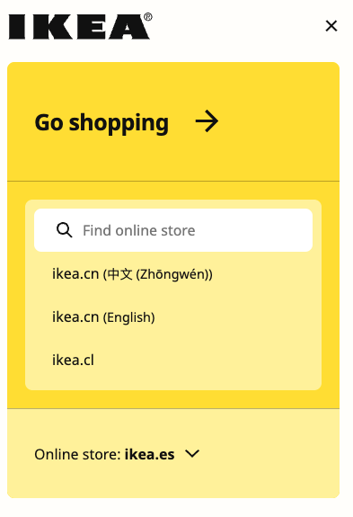
IKEA has an excellent example with a pre-entry site selector that both assumes your location from the browser data and allows users to choose which global website they want. It also considers both endonyms and exonyms, an important localisation factor we will return to further down the page.

Microsoft places their language selector at the bottom of the page in the footer, as indicated by the globe icon.
Once a user is on your page and you have allowed them to change the language themselves, they will search for your language selector. There is no universally agreed method for how and where this tool is located, and you will find that a user experience changes from site to site.
You can commonly find language selector tools at the top of the page, in the header and at the bottom of the page in the footer. These are the two most common locations, but they have also turned up in temporary pop-ups, sidebars and within the page body itself.
Microsoft’s website is an example of including the language selector in the footer. They also auto-redirect you to a global site based on your location. If you do not understand the language, you must scroll through a page of unintelligible text before finding the selector.
The international travel company Booking also redirects you based on location, but their language selector tool sits clearly at the top of the page. This makes it much easier to identify and change if needed, especially on mobile devices.
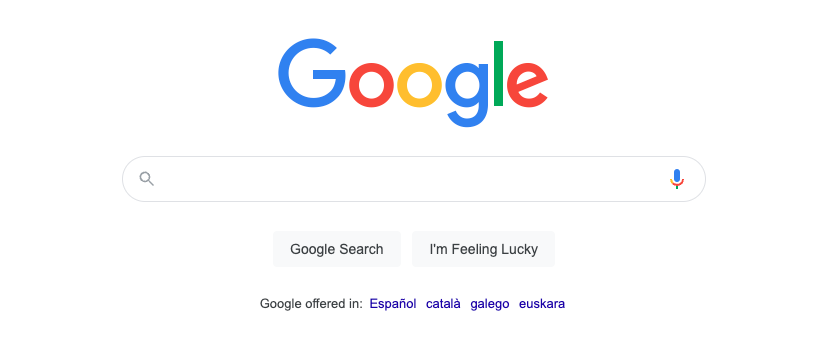
Google, the grandmasters of data collection, automatically redirect you to their best guess language version of their site. With the vast amount of information they hold on you, their best guess is likely to be better than most other sites, down to your region, city and even your street. They have a very limited language selector, offering only languages used nearest to your location in text form and positioned in the centre of the search page.
Surprisingly, changing your language is more difficult on google.com than on other sites. There is no on-page language selector for all languages. If you need a language outside the offered regional choices, you must go into the settings and change it.
Designers agree that a language selector at the top of a page will best serve a customer, especially if it is specifically designed so a user can find it without difficulty in any language.

Google offers just a limited choice of languages based on its intimate knowledge of your location at the time.
How users identify your language selector as your website’s language selection tool is just as vital as the location. To start, it needs to be easily identifiable in any language.
Often this is done graphically by using a globe icon or a flag. These tend to be globally recognised as indicating a tool that can be used to choose a language or localisation setting.
However, using flag icons, while popular, can also cause problems with localisation and could upset specific sectors of your user base. For example, visitors from Ireland are often expected to choose British English or English (UK) as their language option. They may not be thrilled with having to select the Union Jack to represent themselves in place of their own country's flag. Many other such cases may have cultural sensitivity issues where languages cross borders.
Some website language selection tools opt for a textual option, by writing the language or country name for a user to select, often from a dropdown selector. This touches back on an issue we raised before about exonyms and endonyms.
An exonym is a name used for a country by people outside that country, and endonyms are those used by the people living within. For example, Deutschland is the endonym of the country that most Anglophones would call Germany and Francophones Allemagne. Those names are both exonyms.
So, which version do you use in your dropdown? Do you need to use both? In our opinion, IKEA’s take is a great example of best practice procedures. They offer global website options for all endonyms and exonyms typed into the search bar.
It may also be wise to avoid using the words ‘choose language’ as your selector. You need to be sure that a user can quickly identify the button when the alphabet is very different from their own.

Ikea demonstrates best practice in language selection with a powerful search feature on entry to their site.
While the language selection tool may seem like a tiny part of your overall website design, it has enormous implications for how different languages and cultures perceive your website and brand.
There is no perfect way to present changing languages on your website. Still, you can apply some best practices to your selector’s positioning, design and even choice of languages. Experimentation and user feedback are essential to finding the right way to meet your customer’s needs and specialist advice from international language experts like LanguageWire.
If you would like to learn more about how we can help you localise your website for your growing global audience, please get in touch. One of our experts will be happy to help you find the right tools for the job.
Related content
Your journey to a powerful, seamless language management experience starts here! Tell us about your needs and we will tailor the perfect solution to your enterprise.